
Intuitive Care is a healthcare app that helps parents access and connect to resources for their special needs child. It promotes a safe and nurturing space to help parents navigate through the challenges of finding the proper care that their special needs child requires. In turn, this helps alleviate some of the stress and mental burdens that parents of special needs children typically carry.
Role: UX Researcher & Designer
Time: 2 months
The Challenge
Parents of children with disabilities experience an increased risk of mental health issues. They are also at a greater risk of depression and anxiety due to high caregiver demands, stigma and financial strain. Because mental health issues are common in my family, I took on the challenge of using UX research and design to help decrease the stress and anxiety in parents of special needs children.
It is difficult finding and accessing resources and providers for their child’s specific needs.
Through extensive secondary research, I found that parents were more stressed regarding accessing resources for their child, as pediatric specialists are limited. Moreover, finding pediatric specialists with certifications or qualifications in their child’s specific disability is even more challenging.
31%
of parents of children with intellectual and developmental disabilities have moderate depression
79%
of mothers of children with an intellectual disability had depression
40%
of families of children with intellectual disabilities have scaled back their participation in the workforce
Early How Might We Question
How might we help parents of children with special needs attain better access to resources, in order to alleviate their stress?
I originally hypothesized that parents of special needs children weren’t utilizing mental health resources for themselves because of the financial burden. Therefore, providing more free or low cost resources for them will allow them to prioritize their own health and well-being, which will ultimately lower their stress.
Understanding the User
I conducted interviews with parents who had a child with special needs. I then synthesized my insights into an affinity map to identify common pain points, motivations and behaviors. This ultimately led me to identify key themes and insights.
However, through my interview findings, I found that parents are more concerned and stressed about finding and accessing proper care for their special needs child, rather than for themselves. It is very challenging finding and accessing the resources that their child needs, as pediatric specialists are limited. The ones that are available are often located far away, which makes them even harder to access. There is also usually very long wait lists to even see pediatric specialists, which makes accessing resources for their child very daunting and stressful.
Therefore, I had to pivot in my design.
Interview Insights
Support: Having at least one person who can relate to raising a special needs child helps give a sense of hope and comfort
Education: Parents of special needs children feel like many people aren’t educated or aware regarding the actual needs of how to raise and care for a child with a disability
Access to Resources: It’s difficult finding & accessing resources & providers for their child’s specific needs
Time Restraint: Time is the biggest obstacle in managing self-care for parents of special needs children
Overall Well-Being: Parents of special needs children typically prioritize their own health & well-being last
Revised How Might We
How might we help parents attain better access to resources for their special needs child, in order to alleviate their stress?
Persona
I developed a persona that reflected my interview insights. This will also help guide my design decisions and ensure that they’re aligned with my target user’s goals and motivations.
Bio
Sarah is a busy, working mom. She has 2 children, one with autism, Aria, who requires special care and attention. While her job allows her to work from home, her husband works long hours so most of the household and caretaking duties fall on her shoulders.
Sarah feels like she’s constantly behind, as she prioritizes her children and makes sure their needs are met before she finishes her work. She has been having a hard time staying up-to-date with her daughter’s care.
Goals & Motivations
Wants to make sure her child’s needs are taken care of and that she is getting the best care
Wants to make sure her and her husband are educated and up to date on the newest resources to care for their daughter
Wants to connect with other parents in case they have advice regarding care for children on the ASD
Pain Points
Finding specialized resources nearby for her autistic daughter
It’s so hard balancing everything in her life and feeling supported
She is perpetually stressed
Behaviors
Prioritizes her mental health & well-being last
Tries to make time to watch tv to de-stress
Feels guilty taking time out of her day to do something for herself
Once my persona was created, I developed an experience map to understand and gain better insight into her process of trying to find a provider for her child. I wanted to gain a better perspective of what Sarah was thinking, feeling and seeing throughout her process. By identifying Sarah’s frustrations and stressors, I was able to identify opportunities for design intervention.
Experience Map

Epics and User Stories
At this point in my design process, I had discovered the problem, defined what needed help, and now needed to test potential solutions. By creating epics and user stories that pertained to Sarah’s experience, I was able to explore potential features that would help Sarah find a provider for her child.
Ultimately, I found that accessing services was the biggest pain point among parents of special needs children. Much of the stress that these parents experience is related to ensuring they’re able to get their child specialized pediatric healthcare services.
Therefore, the primary user story is: as a parent, I want to book an appointment online for my daughter, with a pediatric mental health therapist that specializes in autism, so that I can get her the care she needs.
From here, I then identified the primary task in order to create a task flow to help build my design intervention around. The primary task is: book an appointment online. I wasn’t quite sure how this process would be different from other healthcare apps, so I decided to sketch out my ideas, design wireframes and then eventually test out my prototype with users.
Task Flow

Translation of Solution
Once I had my task flow created, I began to search for UI inspiration on how I wanted the layout and design of the home screen, specialty selection screen and book appointment screen. Based off of my user interviews, I knew I wanted to create a seamless and easy process for parents to find specialty providers. I also wanted to ensure that parents were aware of the specific qualifications of each provider. Once I gathered my inspiration, I began sketching possible solutions.

I focused my attention on button placements, components and an easy flow for a busy parent. Once I sketched out my ideas, I settled on the cleanest and easiest flow to which I then started translating into mid-fidelity greyscale wireframes. I wanted to see the ideal layout for certain components, to ensure that it addressed my persona’s task flow.

User Feedback
Using my mid-fidelity greyscale prototype, I conducted two rounds of user testing with 10 different individuals. I gave them 4 tasks in order to identify any usability issues through their responsiveness and experience with the design. Using the feedback that I obtained, I mapped out the usability issues and narrowed down recurring confusion or issues. I then implemented changes in order to increase the usability and ease of the app. These were the revisions that I made:

1. Home Screen
This screen was changed in order to improve the clarity regarding the providers list and to make the app purpose clearer and easier to understand for the user. Users also suggested an upcoming appointment reminder section.

2. Provider Selection
I added a radius to the map to identify nearby providers. I also created a list of providers, in addition to the map view, as users commented in both rounds that they would like to see providers and the map simultaneously.

3. Provider Modal
On this screen, I condensed the text to limit the noise on the modal as users felt like it was too wordy for a pop-up box. I also wanted to allow the user to hit the " continue " CTA in order to find out more info.
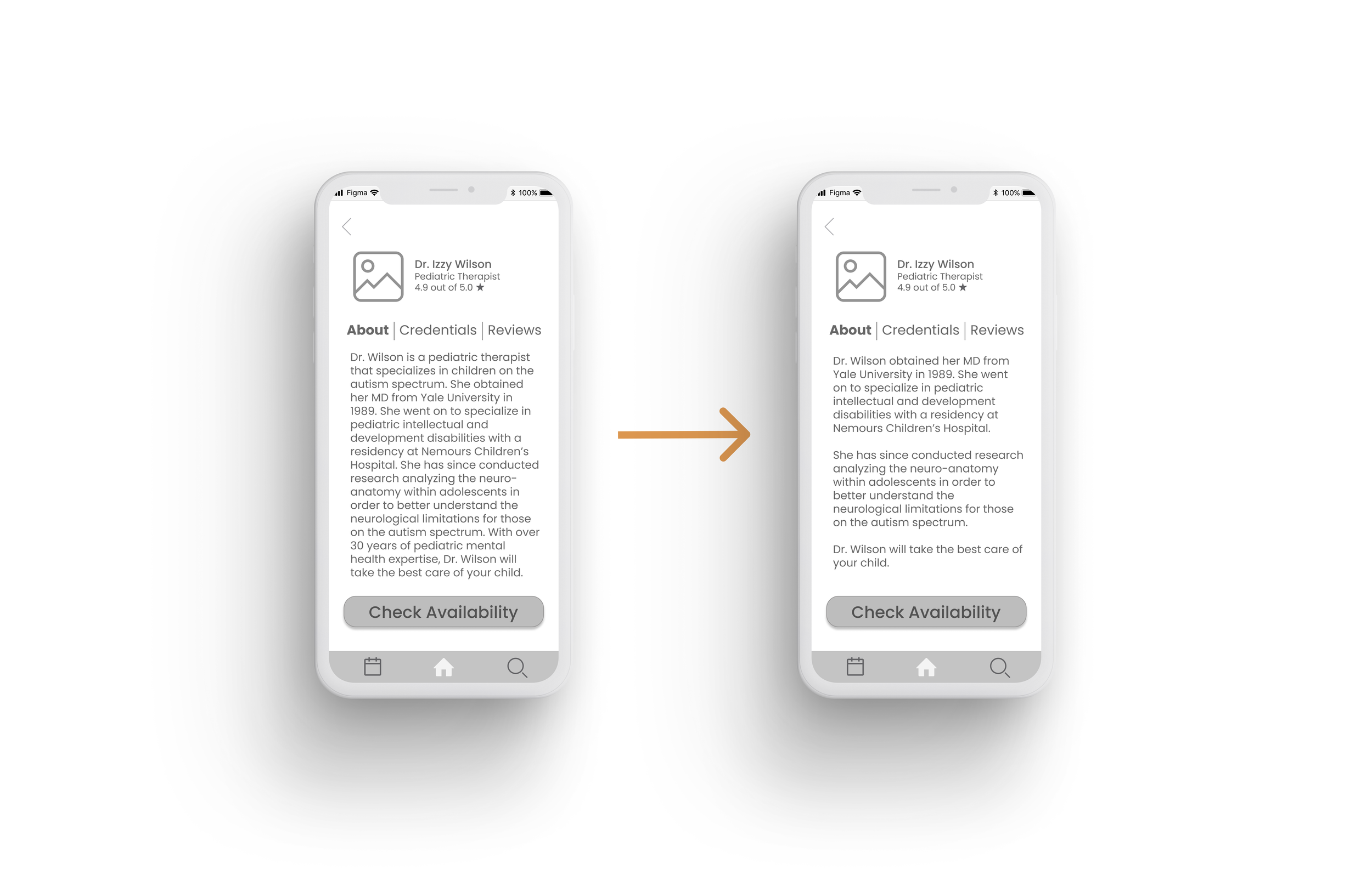
4. About Section
On this screen, I broke up the text into paragraphs to make the info more digestable and easier to scan for the user.

5. Appointment Selection
On this screen, I made it so that the date on the calendar would only be highlighted/circled once the user selected from the next available appointment option.

6. Upcoming Appointments
Users mentioned how they would like a reminders section on the homepage. So, I added the newest appointment to Aria ' s upcoming appointments section.
Creating the Visual Identity
Welcoming
Warm
Cozy
Safe
Innate
Relaxing
Compassionate
Supportive
I then began to work on my brand development and visual identity by exploring keywords that I wanted my app to convey as people used it. I reflected on how I feel when I’m stressed or anxious and what helps me in those moments. These were the keywords that came to mind when I thought of “being comforted” when I’m stressed.
Once I identified the feelings that I wanted to convey, I created a mood board, color palette and typography system that I felt reflected the vibe and aesthetic that I had in mind.

Brand Name Exploration
In order to create my brand name, I started brainstorming words that I felt would convey the purpose of my app. I felt like naming it something health related or care related and I landed on UnityCare, Healthily and Intuitive Care. I ultimately decided on Intuitive Care because I felt like it embodied the feelings that I wanted the app to convey, all while showcasing the care aspect as well.
A brand that makes you feel supported and that you’re not alone. However, I felt like it was too close to United HealthCare, a prominent health insurance company.
Unity Care
A brand that focuses on healthy resources. However, there is already an app with this name. I also didn’t feel like it encompassed the care aspect of the app very much.
Healthily
A brand that focuses on care that is as easy as a mother’s intuition. I felt like this name perfectly embodies the main aspects of the brand— supportive, safe, innate, welcoming, relaxing.
Intuitive Care
Color Injection & Redesign
Once I created my visual identity, I tried exploring different ways to inject color into my prototype. I identified which colors I wanted to use using the 60-30-10 color ratio and I had to adjust color combinations after checking accessibility using the GitHub Accessible Palette Builder.

I knew I wanted my lighter color to be the background, so I mainly played with my primary and secondary colors to see which color usage felt light and calming. I ultimately settled on the circled color combination below.

Once I started designing my hi-fi prototypes and injecting color, I realized that my mid-fi wireframe for my home screen felt unbalanced. I played around with the size of the cards, as well as a vertical and horizontal list of current providers. I asked friends and family which was their preference and a majority liked the vertical view with the “see more” expansion. I tried playing around with the spacing and tried accounting for user error via touch (for the messaging/call) in the second screen by creating more distance between the current providers. Based off of my persona though and the main feeling I wanted to convey through my app, I went with the last screen for the simplicity, ease and consistency of it.

Hi-Fidelity Prototype
I then translated my visual identity to the rest of my screens in order to create a clean and refreshing app for parents. I wanted the rest of the screens to have a sense of ease and calmness, almost like taking a stroll in the park.
Marketing Intuitive Care
The next step that I took in my design process was to explore how I could market my app. Through my research, I realized that identifying how users find and download apps ultimately helps us design marketing websites that will inevitably build familiarity and trust for the users during their research process. I then gathered more UI inspiration in order to design a thoughtful narrative for a mobile and desktop marketing site.

Expanding Across Platforms
I explored other platforms that Intuitive Care could be accessed on. Even though my persona mainly uses desktop or mobile, I decided to translate to a tablet version because of insights from user interviews. Because of how busy parents are, especially parents of special needs kids, they’re constantly on-the-go. Having another platform to access while they’re out and about running errands or going to their child’s appointments helps them continue to stay on top of their child’s care.
Moreover, the users that I interviewed also have iPhones and other Apple products.

Future Roadmap
Providing a safe space for parents of special needs children to access the proper care and resources for their child ultimately helps lessen some of their stress and anxiety. During interviews, users expressed how having a community of other parents who had children with the same disability made them feel a sense of comfort and ease in knowing that they weren’t alone. Users also expressed how difficult it was for other people to relate or understand what they were going through. Intuitive Care was specifically designed with that in mind.
While I didn’t build out the onboarding process for the app, I alluded to this functionality on the provider selection screen with Aria’s diagnosis under her name. The next step I’d like to build out is to incorporate a fluid and intuitive process to identify the specific care and resources that the special needs child requires. This will allow Intuitive Care to truly help parents stay on top of their child’s healthcare.
Reflection & Learnings
Because of the sensitive nature of my topic, I realized how wording and verbiage are so important. Some terminology may be common knowledge to one person, but not for another. I tried to conduct research on my own regarding proper references, but I made sure to preface during my interviews that I’m new to this problem space, I don’t mean to offend and I’m happy to be corrected.
Proper Verbiage
Throughout my design process, I realized how important it was to continuously put myself in the shoes of the user. Obtaining user feedback, even if it was informal, really helped in my design process because it gave me fresh insights and perspectives that improved the usability of my app. There were moments when I had to change my design or pivot, but it allowed me to remain heart-centered and user-centered in my process.
User Feedback
Thank you for taking the time to read this!
Let’s work together! I’m open to full-time opportunities. Feel free to connect with me!